There are many data points to analyze before trading stocks and ETFs. In addition to poring over earnings reports, analyst reports, and news headlines, knowing how to read stock charts can be a big help.
Reading charts can help short-term traders and long-term investors spot trends and find stocks to buy, sell or avoid.
You don’t have to know what a “head and shoulders pattern” or a “cup and handle pattern” is to start using charts – but you can learn how to spot these trends as you gain experience. There are several indicators you can use to screen stocks and rebalance your portfolio.
Here are some of the primary indicators that can improve the research process for new and experienced investors.
Table of Contents
Stock Price Trendline
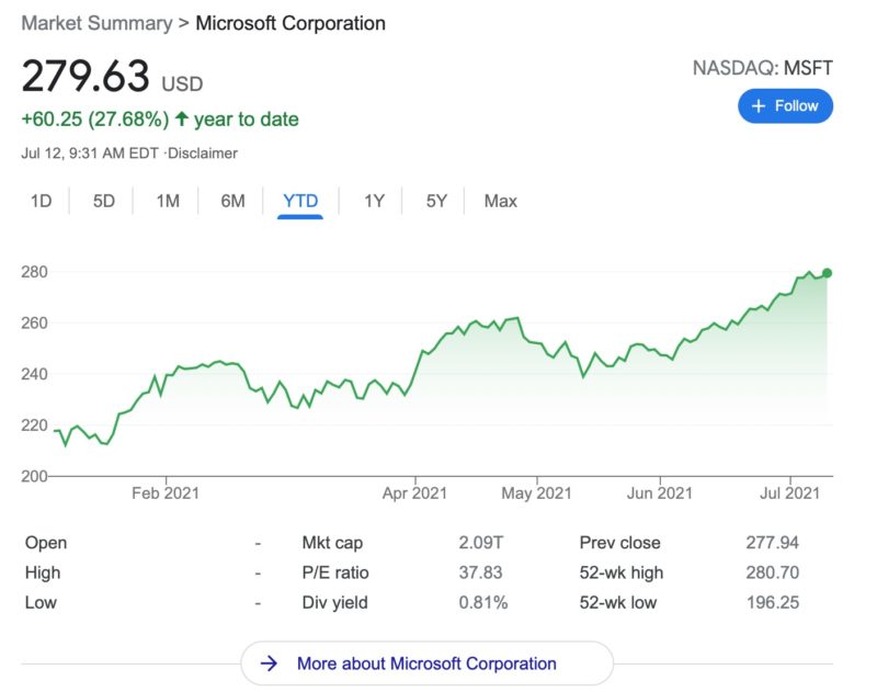
The stock price trendline indicator looks at the stock price history. You can determine if the share price is in an uptrend, downtrend, or relatively flat for a specific timeframe.
You shouldn’t rely only on the stock’s current price to make an investment decision. However, the price history can provide clues about where to spend your research time.
For example, a larger-than-usual price drop can be a red flag that the stock has more downside risk ahead. You will need to see if the price drop is from a temporary setback from a one-off event and it makes sense to “buy the dip.” Or, there’s a structural weakness that can take years to correct, and buying now means you’re “catching a falling knife” as the price will continue to drop or likely won’t recover soon.
Any online broker shows the current and historical share price. You can also access free price charts on the Google and Yahoo search engines.

Pay Attention to the Time Interval
It’s also essential to choose an appropriate time interval. The interval can be as short as the current trading day, up to ten years ago, or somewhere in-between.
If you choose a daily, weekly, or monthly timeframe, you can break down the chart into a shorter sub-interval for the opening and closing prices.
Some of your interval options can include:
- Daily: 5 minutes, 10 minutes, or hourly sub-intervals
- Weekly: Daily or hourly sub-intervals
- Monthly: Daily or weekly sub-intervals
If you use a candlestick-type chart, you will see the opening and closing price for the sub-interval. For example, if you choose a one-month chart with a daily sub-interval, the chart can display the opening and closing price for each of the past 30 days.
You will need to pick the best interval for your investment strategy.
Line Chart Vs Candlestick Price Charts
You will quickly notice that the best stock screeners give you many interactive tools. However, the options can be overwhelming until you try a few and find out what works for you.
One option you will need to choose is having a line chart or a candlestick display.
Here is an example of what a line chart and a candlestick chart can look like.
Line Chart
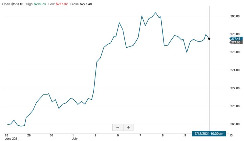
The line chart provides a cleaner glimpse at price history. However, you won’t see the intraday price action that can be vital to effective technical analysis.
Candlestick Chart
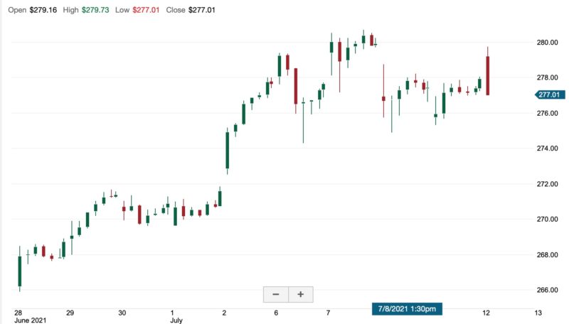
The candlestick chart provides an in-depth look at the share price movements. For instance, you can spot a full candle close above or below the previous trading session. Depending on your strategy, this data shows when you might enter or exit a trade.
The above screenshot is for a “filled candlestick” chart. There are a couple of varieties of this chart that indicate the opening and closing price differently.
Here are some of the details a candlestick shows:
- Solid green bar: Stock price closes higher than the opening price. The bottom of the bar is the opening price and the top bar is the closing price.
- Solid red bar: Stock price closes lower than the opening price. The bottom bar is the closing price and the top bar is the opening price.
- Bar tails: Each bar has a skinny “tail” above and below the bar. This tail indicates the highest and lowest share price for the time interval.
Trading Volume

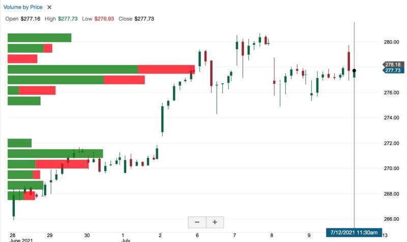
The trading volume metric lets you see how many shares are swapping hands on a time interval can help you spot bullish or bearish sentiment.
High trading volumes can indicate that “smart money” like hedge funds and institutions buy or sell shares. Conversely, low volume can suggest that individual investors are pushing the share price.
Upper Indicator vs. Lower Indicator
Charting tools will display a measure as either being an upper indicator or a lower indicator. Upper indicators show with the price history. Lower indicators show below the price history chart to prevent confusion.
In most cases, volume is a “lower indicator” and the metric displays underneath the price history chart.
However, the Volume by Price is an upper indicator and shows the trading activity by share price instead of by trading day. Below is an example of the trading volume upper indicator.
Moving Average
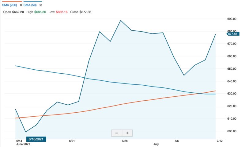
The daily moving average is an upper indicator and indicates if the share price is trading above or below its average price for a specific time period.
There are two different versions of the moving average:
- Simple moving average (SMA): The average of the closing prices for a specific time interval (i.e., 9 days, 50 days, 200 days)
- Exponential moving average (EMA): Average of the closing price but emphasizes recent prices. The SMA uses a non-weighted average.
The SMA indicator tends to be more widely used but either metric can help you spot bullish or bearish patterns. In many cases, both indicators produce similar reports.
For shorter time intervals, the EMA can be more effective as it has less lag.
50 and 200-Day Moving Average
Many technical traders use the 50-day and 200-day moving average as a baseline. For instance, swing traders might only buy a stock trading above the 200-day average. Price action is usually bearish as long the share price remains below the 200-day.
These two intervals can indicate a “golden cross” or a “death cross” when the lines intersect.
Here is a quick definition of a golden cross and death cross:
- Golden cross: The 50-day moving average goes above the 200-day average. This action indicates the short-term share price is likely to increase. As a result, traders are usually bullish and are more likely to buy shares.
- Death cross: The 50-day moving average crosses below the 200-day. This action indicates share prices will drop in the near term. Short-term traders usually close a position when a death cross appears until the downtrend reverses into an uptrend.
Neither cross guarantees a stock price will increase (golden cross) or go into a downtrend (death cross) but the probability is higher than usual. Of course, predicting the timing of the price move can be more challenging and you should only buy or sell positions that fit your investment strategy.
Here is a guide from Investopedia about moving averages.
RSI

The Relative Strength Index (RSI) is a lower indicator with a 100-point scoring range that can help investors determine if a stock is overbought or undersold.
Two extremes can suggest a share price reversal:
- Overbought: An RSI between 70 and 100 indicates shares might be overbought or overvalued and the price may dip.
- Oversold: An RSI between 0 and 30 suggesting shares are oversold and will increase in price soon.
Typically, short-term traders like to buy stocks when the RSI is above 50 and in an uptrend. You might also consider scooping up shares when the RSI is an “oversold” territory.
MACD

The Moving Average Convergence/Divergence (MACD) indicator can help short-term traders find bullish and bearish trends. This indicator doesn’t necessarily estimate if a stock is overbought or oversold like the RSI but if the price action is bullish or bearish.
This indicator typically uses the 9-,12, and 26-day Exponential Moving Average to
Investors can compare the MACD (pronounced Mack-Dee) to the share price to look for possible divergences. For instance, a declining share price but a positive MACD may indicate an imminent reversal and the opportunity to make a short-term trade once share prices increase.
There are three different puzzles pieces for the MACD indicator:
- MACD histogram: A bar chart showing the divergences between the MACD indicator and the share price trend
- Signal line: The MACD measurement reflecting the share price history
- Divergence: A positive divergence line is above the signal line and indicates positive sentiment. A negative divergence happens when the divergence line goes below the signal line and suggests short-term prices will go lower.
Traders might use the moving average, RSI, and the MACD in their trading system to find buy and sell signals.
Dividend and Stock Splits
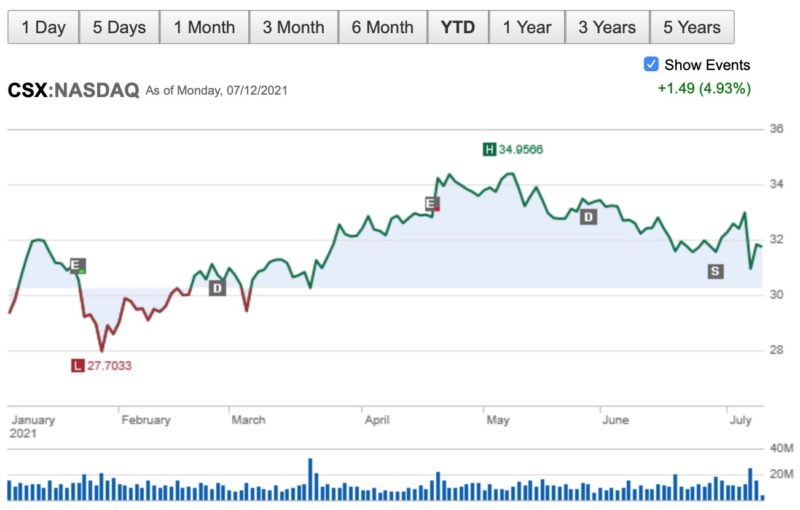
Many brokers and screeners display the dividend and stock split events in the price history chart. Seeing these events on the chart can help you determine how the share price responded.
Your charting tool might also show the earnings report dates too.
Fundamental Stock Metrics
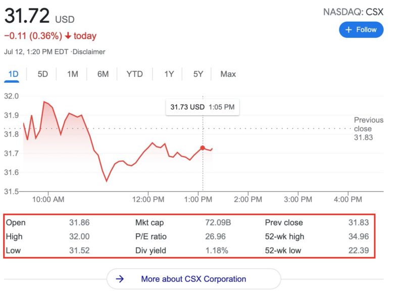
Stock charts and fundamental analysis may seem to be contradictory.
Fundamental investors can benefit from knowing how to read stock charts too.
Some of the lower indicators include:
- Dividend yield
- P/E ratio (price-to-earnings)
- Revenue
- Rolling EPS (earnings per share)
Your research tool may also let you add secondary indicators like the moving average.
In addition to the price charts that have a customizable time period, you can also compare investing ratios to other watchlist stocks or a benchmark index.
Some of the fundamental metrics you might look at include:
- Market cap
- Current dividend yield
- 52-week high and low
- Put/Call ratio
These ratios won’t help you make a momentum trade. But if you want a long-term investment, you can find profitable companies or those currently trading at relatively low valuations.
Do I Need Special Stock Charting Software?
If you’re just starting to figure out how to read charts, you can use your broker’s charting tools. Admittedly, some micro-investing apps like Robinhood and M1 Finance only show the price charts.
But if you have an online broker like Fidelity, Schwab, and Ally Invest offer many fundamental and technical indicators that are sufficient for casual investors.
Best Stock Analysis Tools
There are several free stock analysis tools you can use as well. These platforms can offer more features than most brokerage chart tools.
Here are some of the charting platforms you can use to use your favorite indicators.
E*TRADE
E*TRADE is one of the oldest online brokers and they offer robust charting tools and many investment options.
Technical traders may love the Power E*TRADE platform that automatically draws to find the support and resistance levels. The platform offers more technical studies than many brokers.
The standard E*TRADE platform is also feature-packed and sufficient for most investors who want to read stock charts to supplement their current research process.
There are zero trade commissions to buy or sell stocks and ETFs.
This online broker lets new members earn bonus cash by making a qualifying opening deposit. For more information, check out our E*Trade review.
Ally Invest
Ally Invest offers commission-free trading for stocks and many ETFs. The platform also has extensive charting tools with many technical studies and fundamental metric snapshots.
Options traders can also use a profit/loss calculator and probability calculator to estimate the odds of investment success before placing an order.
Here’s our full Ally Invest review to learn more.
Webull
Webull doesn’t offer the most advanced technical indicators (50 vs. 100+ for the full-service platforms). However, you can paper trade stocks for free to test your new technical analysis strategy.
Stock and ETF trades are commission-free. You can also get three months of Nasdaq Level 2 Advance data to see the real-time buy and sell asking prices for tickers on your watchlist.
Here’s our full Webull review to learn more.
Stock Rover
Stock Rover is a third-party stock research software and is one of the best options for fundamental investors but the technical analysis tools are good too. The platform has in-depth charting tools and an interactive stock screener to comb through stocks and funds that fit your metrics.
You can also find investing ideas using premade filters that copy the investment strategies of famous investors and hedge fund managers. This service requires a paid subscription to get the best research tools.
Here’s our full Stock Rover review to learn more.
Charles Schwab thinkorswim
Online broker Charles Schwab, after its acquisition of TD Ameritrade, how operates the well-known and powerful thinkorswim platform. There is a desktop, web, and mobile version and each has its own strengths and limitations.
Any version is free and offers some of the most advanced research tools for charts and stock market news.
Beginner investors may find thinkorswim challenging to use until their experience level increases. On the bright side, the standard TD Ameritrade platform also offers plenty of charting tools, research reports, and market insights that barebones investing apps (i.e., Robinhood) don’t offer.
Fidelity
Fidelity is another popular online broker with extensive fundamental and technical research tools with the web or mobile dashboard. Consider the free Fidelity Active Trader Pro desktop platform for advanced charting tools.
The Fidelity mobile app can help you research basic charts on the go. Another advantage of the mobile app is buying $1 fractional shares instead of whole shares like other brokers require.
See if a Fidelity brokerage account promotion can help you earn bonus cash.
Summary
Stock charting may seem unnecessary or time-consuming for non-professional investors. However, basic chart reading skills can help any investor wanting to buy individual stocks or ETFs.
Charting can also be an excellent way to determine if stock tips from newsletters are worth buying – or if the suggestion is mostly hype. The best course of action is to try these initial indicators, find out which ones work best for you, and then consider adding advanced charting tests if you rely extensively on technical analysis.


